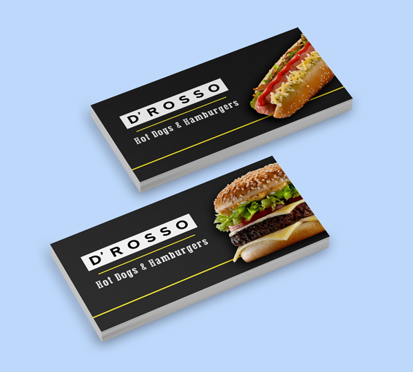
This is a familiy fast food entrepreneurship with almost 20 years on the market sponsoring horseback riding championships in Bogota, Colombia.
D’Rosso went on for many years without a logo or brand recognizable by the public that represented the quality, trust, love and effort with which the products are prepared and every single customer is served.
PROJECT SPECS
Logo Design
Brand Identity
Advertising Material
Packaging and Uniforms
HERRAMIENTAS USADAS
PROJECT SPECS
Logo Design
Brand Identity
Advertising Material
Packaging and Uniforms
HERRAMIENTAS USADAS
LOGO DESIGN
RESULT
This branding design consists of a robust logo with high contrast, which could facilitate its legibility and appeal while presenting the qualities for which D’Rosso is known among its regular customers, in addition, there was developed a graphic line that uses a typography and different elements with a chalkboard effect.
FONTS & COLORS
CMYK: 4 0 82 0 RGB: 255 236 59 HEX: #FFEC3B
CMYK: 0 0 0 0 RGB: 255 255 255 HEX: #FFFFFF
CMYK: 79 69 61 88 RGB: 19 19 19 HEX: #131313
PRESS STYLE SERIF
NEXT ART
APPLICATIONS
OTHER PROJECTS
If you have a project in which you’d like to work with me…